OGECHUKWU OKAFOR
Graphic design | Branding | Illustration

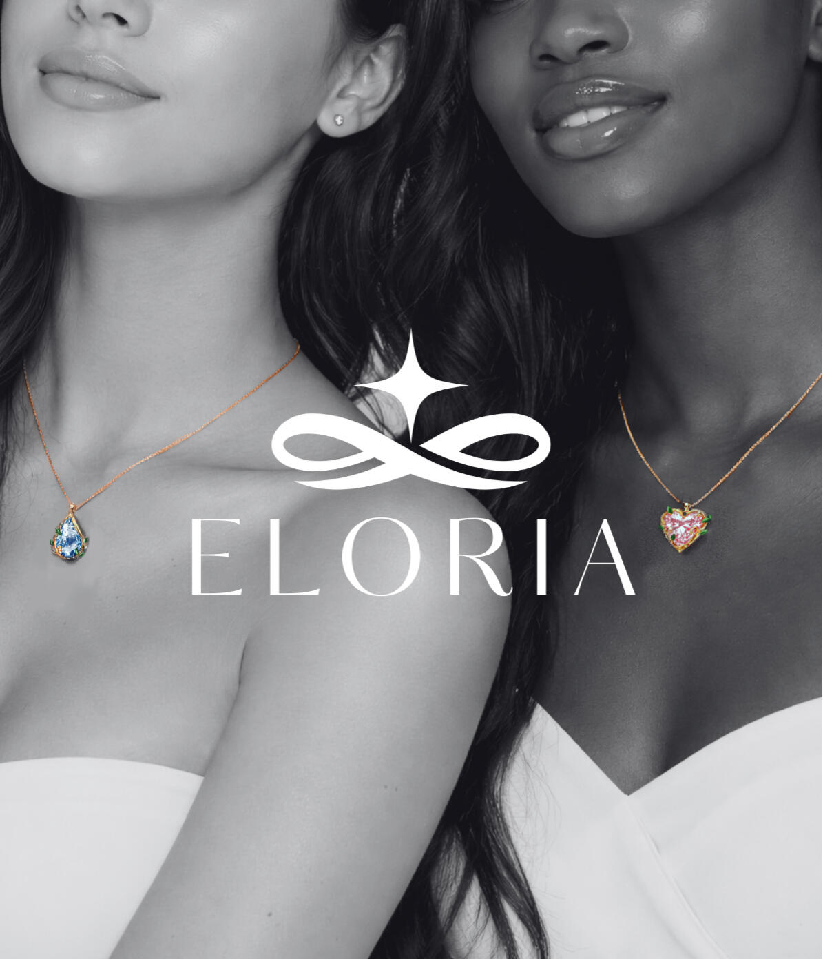
Eloria Jewelry
PRODUCT CAMPAIGN | PACKAGING

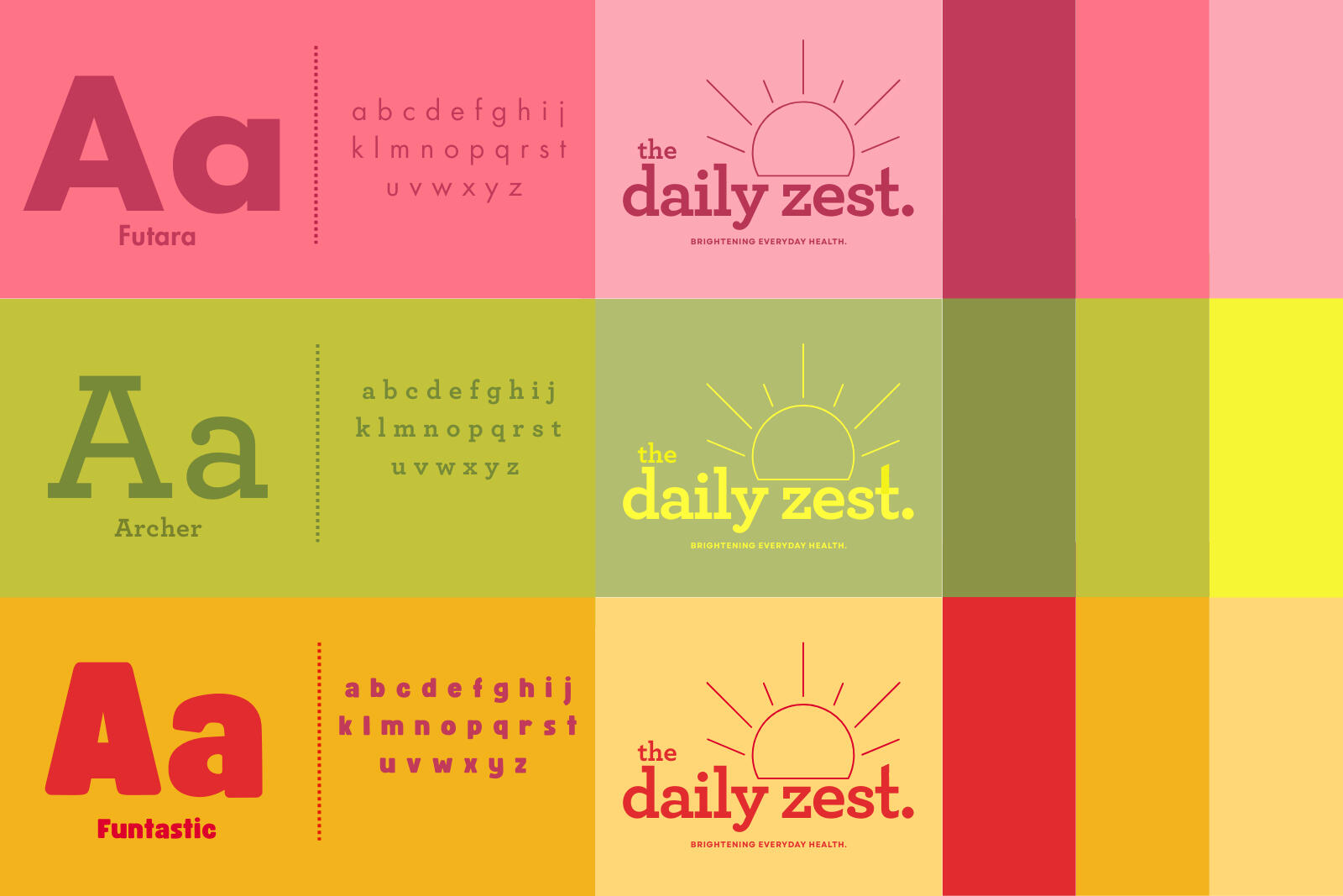
The Daily Zest
BRANDING | PACKAGING

Strawberry valentine
PRODUCT DESIGN | PRINT DESIGN

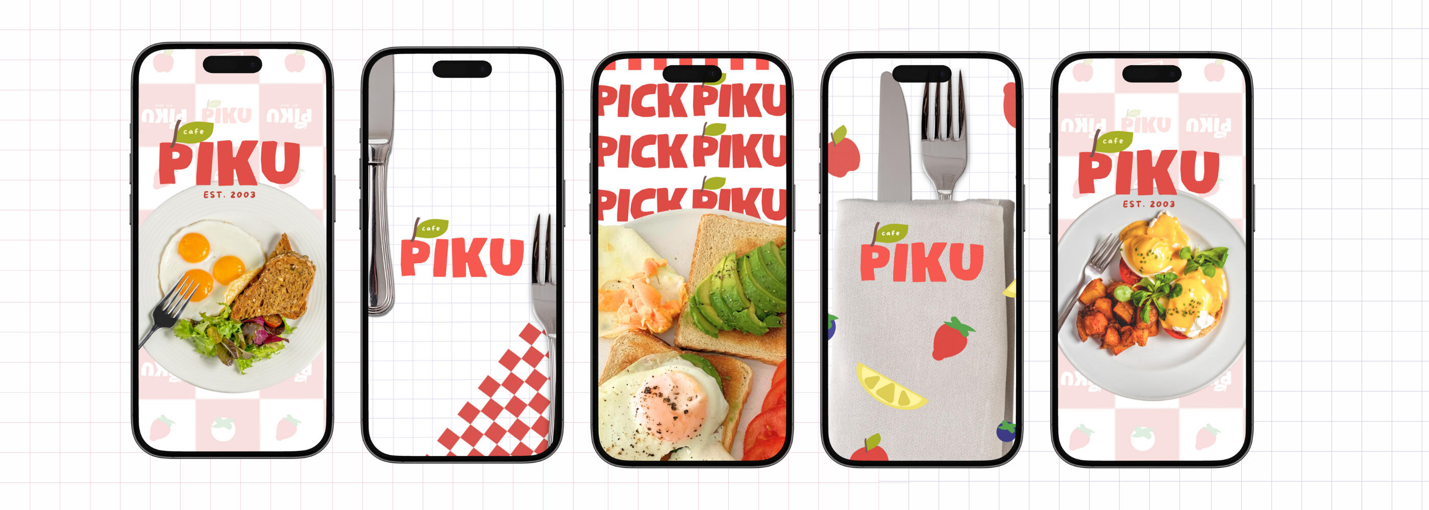
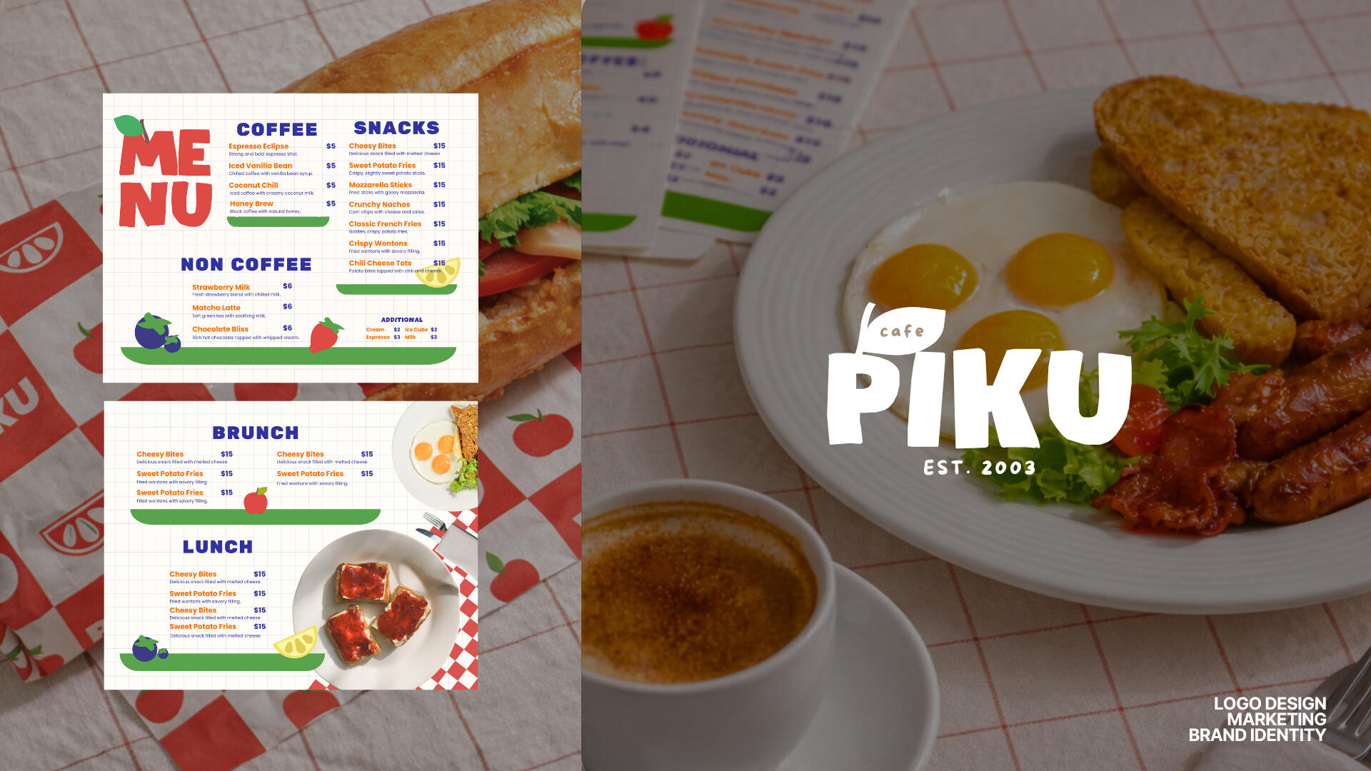
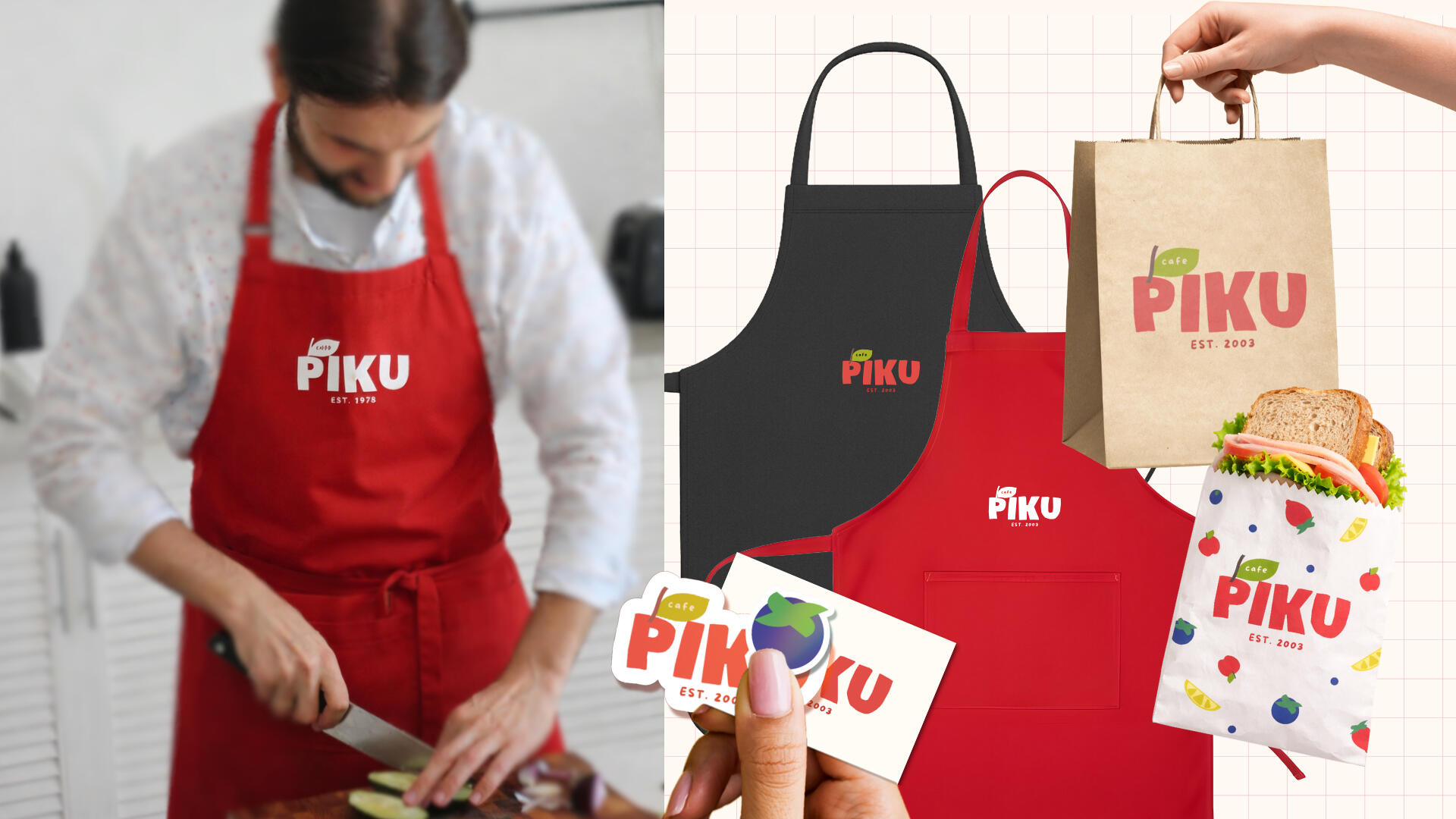
Cafe Piku
LOGO DESIGN | BRAND IDENTITY

Embrace
MARKETING CAMPAIGN | SOCIAL MEDIA

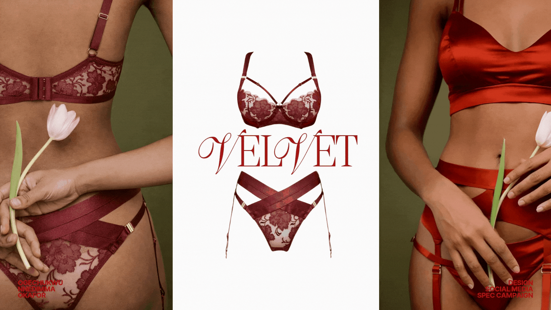
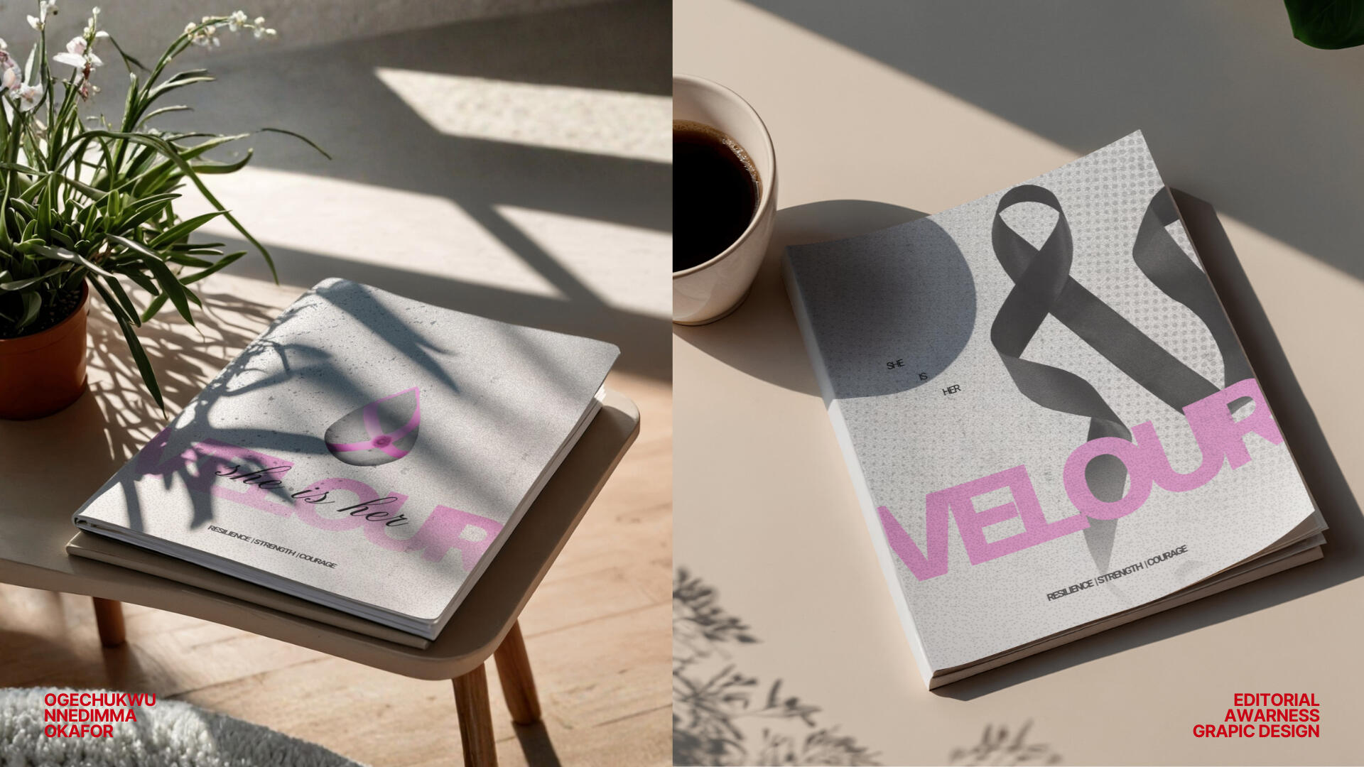
VELOUR
EDITORIAL | LAYOUT DESIGN

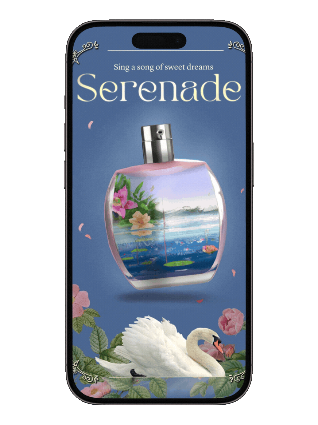
Serenade fragrance
PRODUCT DESIGN | POSTERS

Orbit astrology app
UI/UX | ILLUSTRATION

LOCKET
PHOROGRAPHY | OBSERVATION

Eloria Jewelry
PRODUCT CAMPAIGN | PRINT DESIGN

Book Covers
UI/UX | ILLUSTRATION

Concept art and Illustration
EDITORIAL | LAYOUT DESIGN
Cafe Piku
Vestibulum id purus penatibus curabitur posuere natoque cursus. Rutrum odio tincidunt lacus fringilla imperdiet.

Text
OGECHUKWU OKAFOR
Graphic design | Branding | Illustration
OGECHUKWU OKAFOR
Graphic design | Branding | Illustration
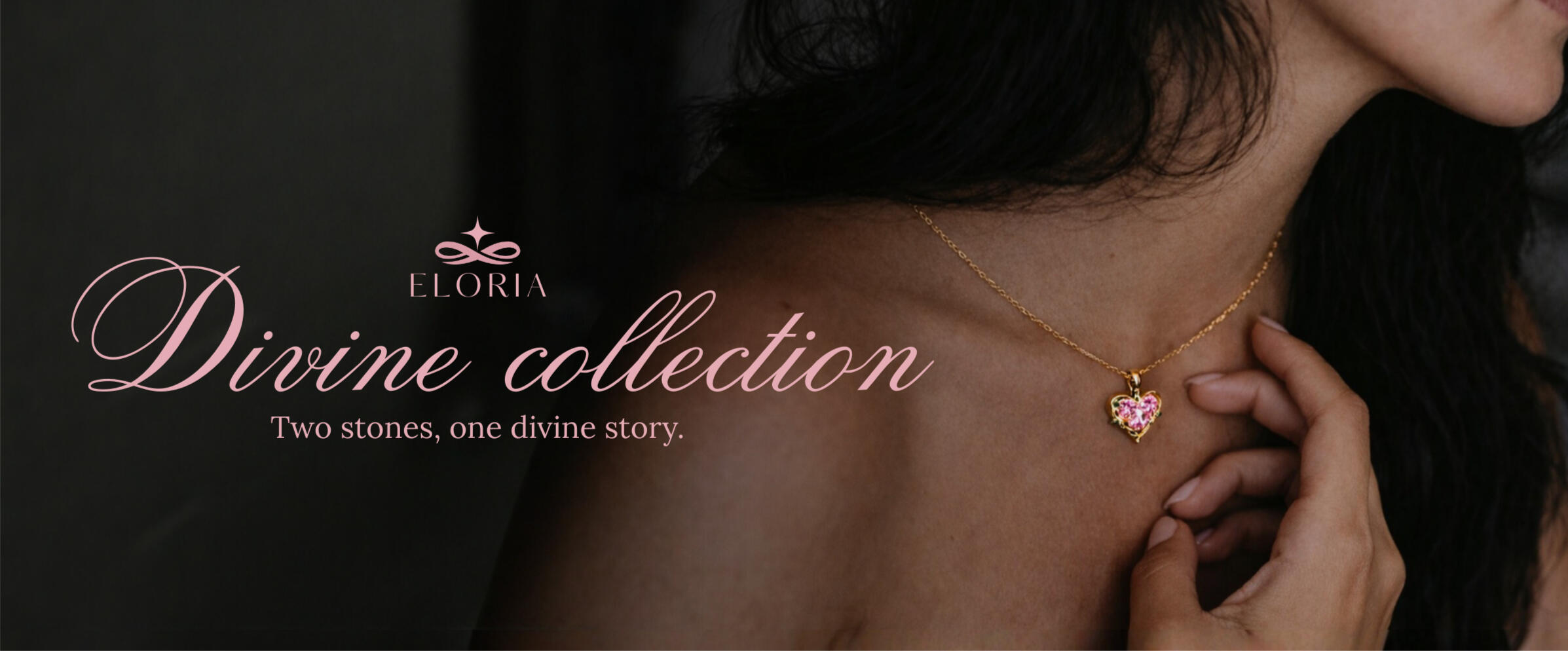
This project explores the development of a product campaign and packaging system for Eloria Jewelry, a conceptual fine jewelry brand centered on feminine elegance and modern luxury. The campaign introduces The Divine Collection, a limited release featuring two signature necklaces: Amora, a pink heart diamond pendant, and Celeste, a blue teardrop diamond pendant — designed to symbolize love, grace, and timeless beauty.The goal of the project was to create a cohesive visual identity and launch campaign that captures the brand’s delicate yet striking aesthetic. The design direction combines minimal, refined layouts with soft romantic color palettes, allowing the jewelry itself to remain the focal point while reinforcing the brand’s ethereal and luxurious tone.
The campaign includes a range of promotional and packaging materials designed to support a collection launch across both digital and physical touchpoints. These deliverables include website visuals, social media assets, campaign banners, product packaging, and branded print materials.To create a fully realized brand experience, the project also involved the conceptual design of the jewelry pieces themselves, along with product photography and marketing visuals. The result is a cohesive campaign that highlights Eloria’s identity as a modern, feminine jewelry brand that celebrates elegance, emotion, and refined simplicity.


Packaging design


Website and Social media


OGECHUKWU OKAFOR
Graphic design | Branding | Illustration
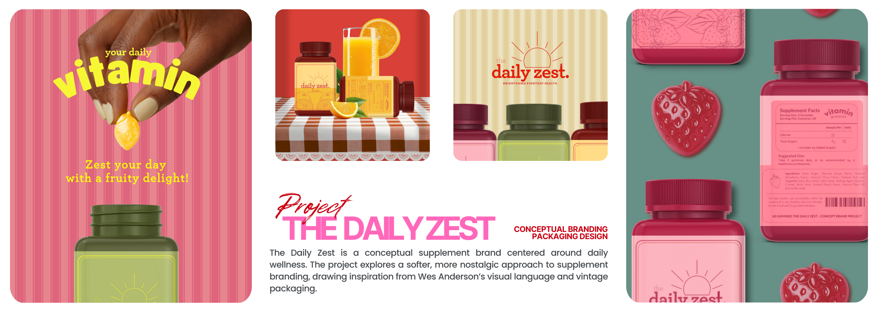
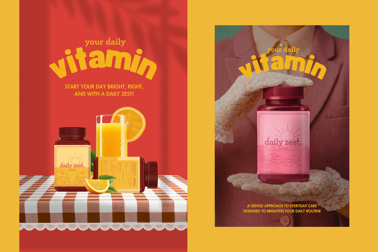
For this project, I wanted to move away from the loud, performance-driven language often used in wellness branding and instead focus on calm, routine, and familiarity.Visually, the brand is built around symmetry, restrained typography, and a limited colour palette, drawing inspiration from vintage packaging and the composed stillness found in Wes Anderson films.The imagery treats the product as an everyday object, staged in deliberate, almost theatrical scenes rather than lifestyle photography. The goal was to create a cohesive system across packaging and visuals that frames the product as part of a daily ritual, rather than a high-energy commercial offering.


OGECHUKWU OKAFOR
Graphic design | Branding | Illustration


Notebook design variations

With Love, Always

A Yearlong Crush

Love In Passing

Dear To Me

The Love One
Bound To You


Promotional and display Posters


OGECHUKWU OKAFOR
Graphic design | Branding | Illustration
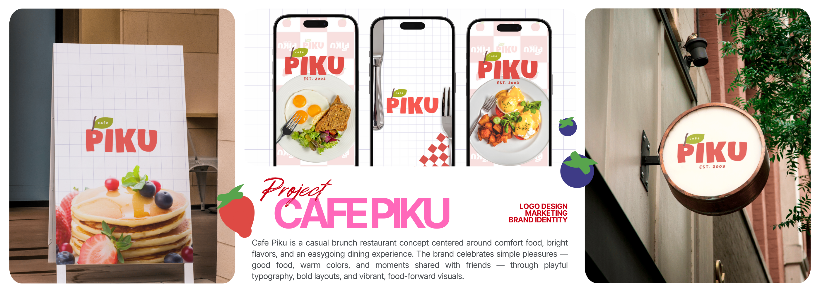
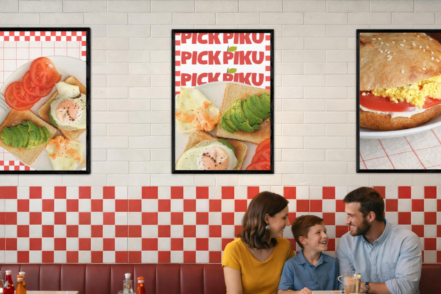
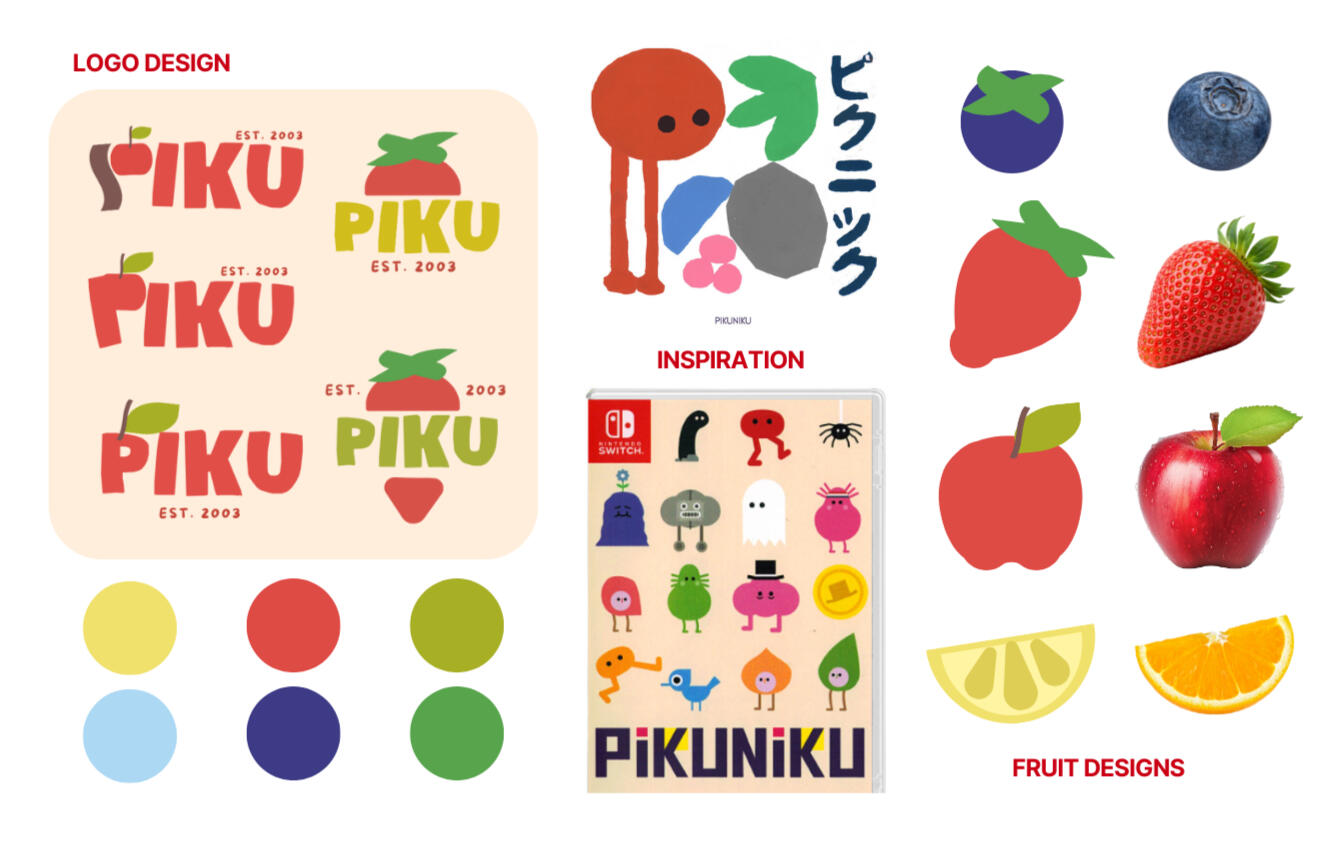
VISUAL LANGUAGE
The visual language for Cafe Piku is inspired by PIKUNIKU, a Japanese platformer video game known for its bold, graphic, and simplified art style.
The goal was to capture the game’s playful energy and translate it into a friendly, approachable café brand.
Using this reference, I created a set of simple fruit designs to be used across branding and marketing materials. Muted primary colors were chosen to keep the identity playful while adding warmth and an organic, food-focused feel.
OGECHUKWU OKAFOR
Graphic design | Branding | Illustration
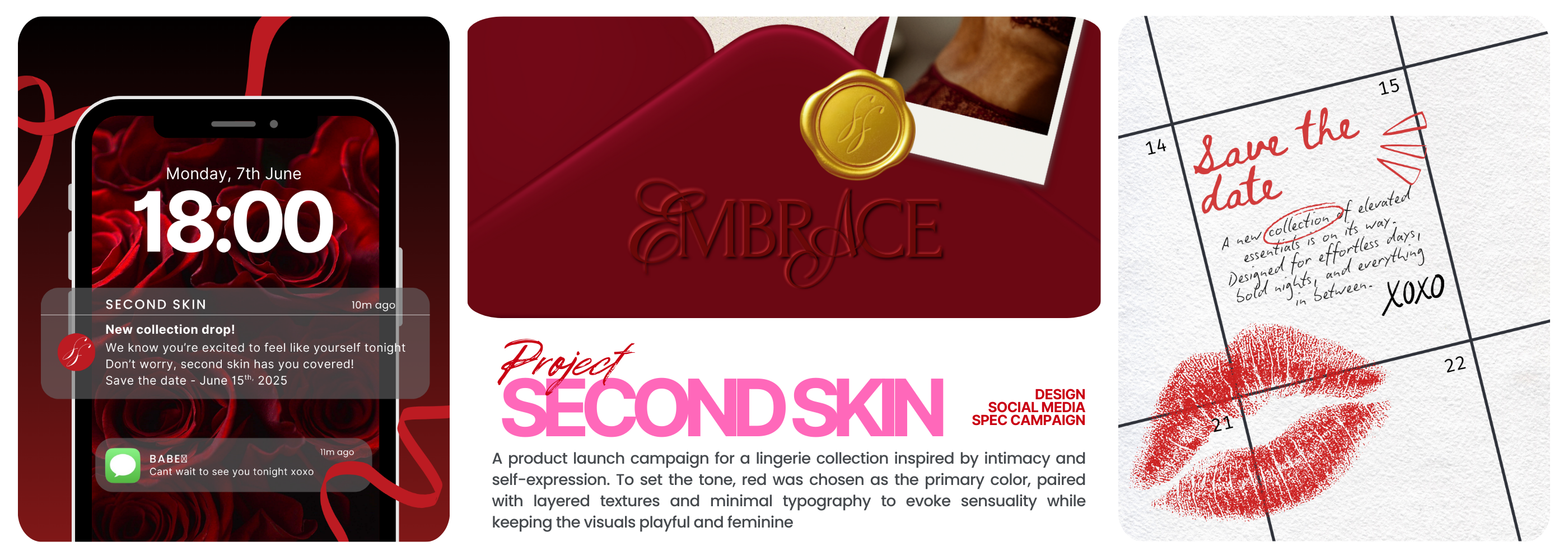
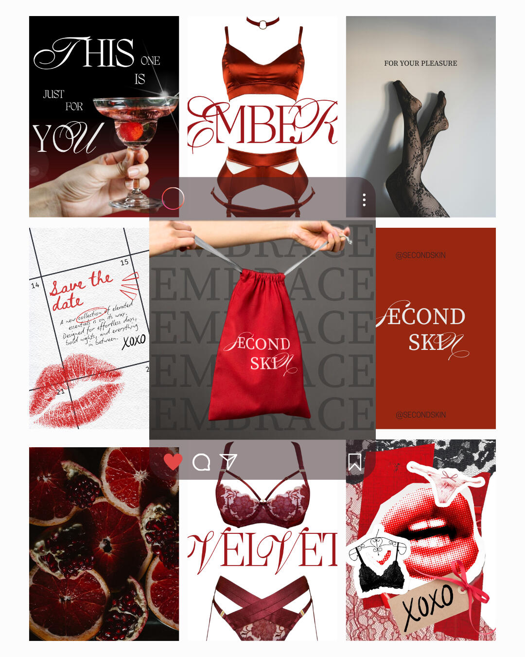
The goal of this project was to design a cohesive set of digital assets that introduce the collection, capture attention, build anticipation, and communicate the essence of the collection across social media and email marketing.
I designed and created social media assets to showcase the products and support launch announcements, using a cohesive aesthetic that reinforces the sensual tone of the campaign while remaining playful and on brand.
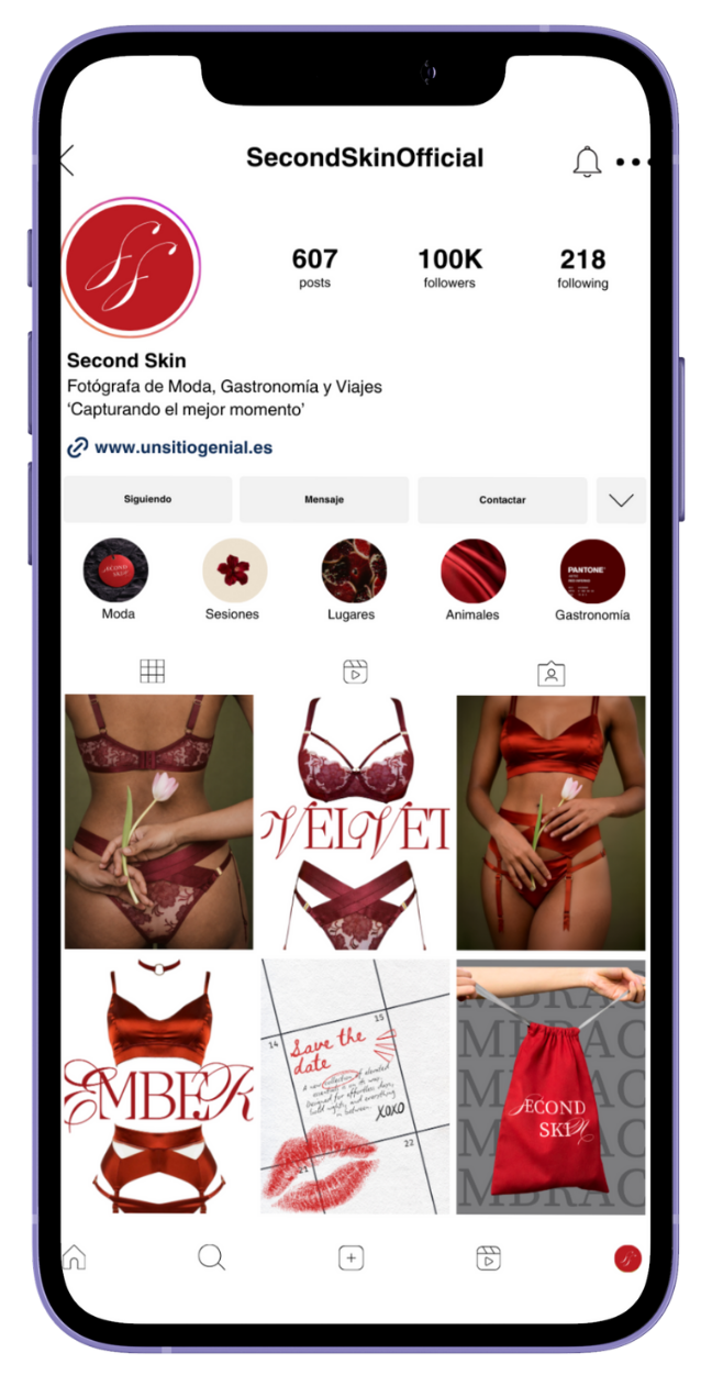
social media promo posts


OGECHUKWU OKAFOR
Graphic design | Branding | Illustration
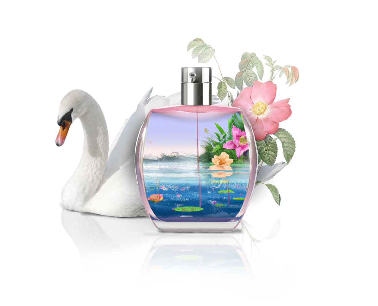
A series of promotional images for a fragrance, focused on creating elegant, ethereal visuals that evoke a refined mood and sense of storytelling. Through carefully considered composition and layout, the imagery is designed to elevate the product, strengthen its narrative, and enhance its overall brand presence and appeal.


OGECHUKWU OKAFOR
Graphic design | Branding | Illustration
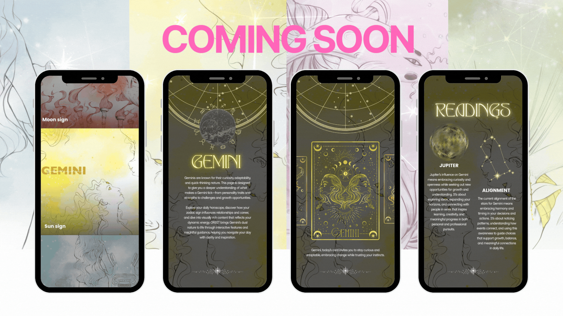
ORBIT is a mobile app designed to deliver personalized astrology insights through a visually engaging and intuitive experience. My role focused on developing the visual direction, interface layouts, and supporting illustrations to create a cohesive, immersive system within a clean and approachable UI.Full project case study coming soon.
OGECHUKWU OKAFOR
Graphic design | Branding | Illustration
I created a series of editorial-style designs for a brand centered on breast cancer awareness, using bold composition with a black and pink color palette to create a striking contrast and present femininity as confident, powerful, and unapologetic.


OGECHUKWU OKAFOR
Graphic design | Branding | Illustration
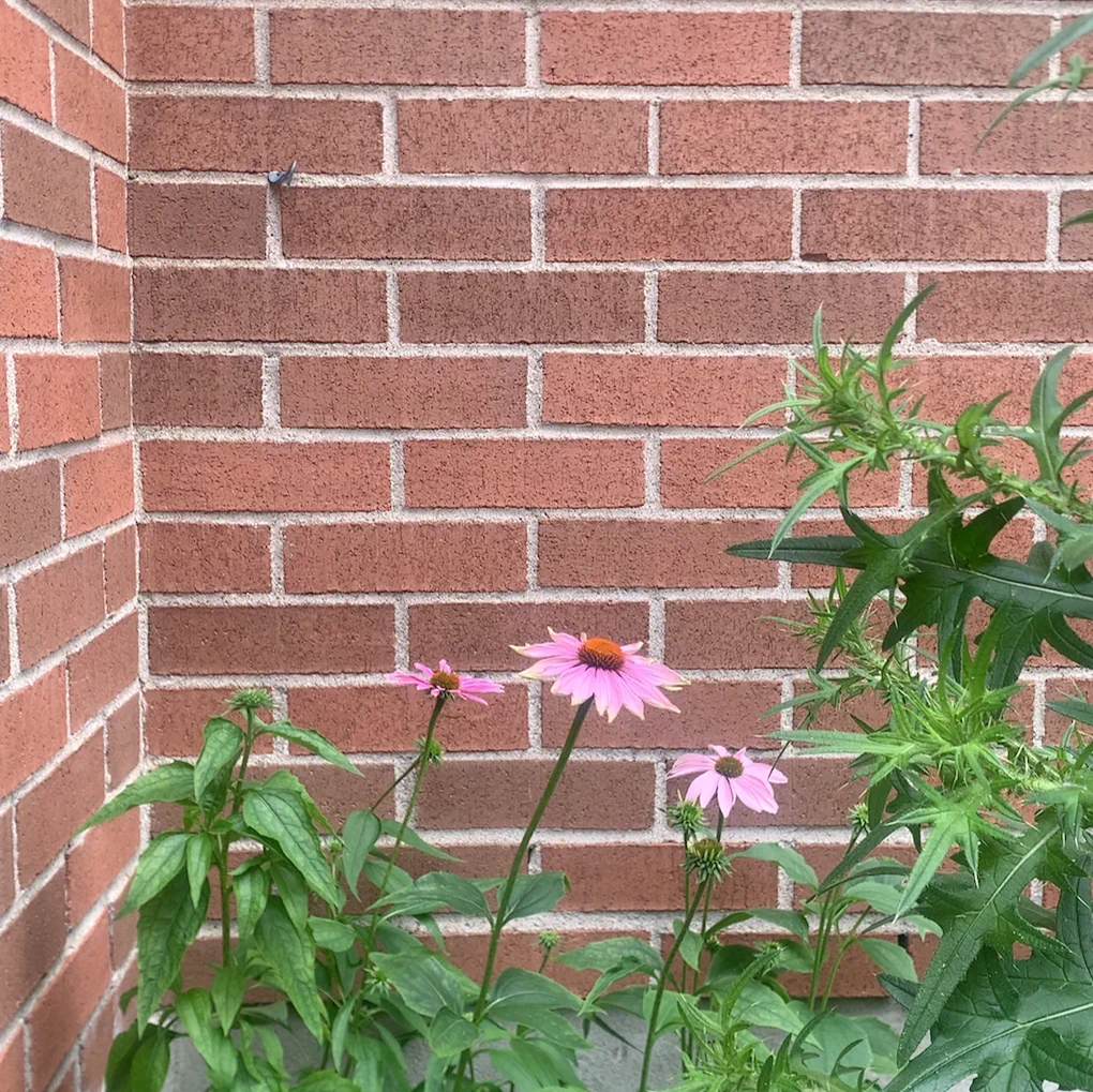
Locket is a small personal photography project created as an exercise in OBSERVATION. The goal is not to have perfectly edited final photos, but to sharpen my eye for beauty in everyday moments.While I’m not a professional photographer, this project has helped me notice subtle color relationships and strengthened my design thinking by observing naturally occurring compositions and framing, skills that translate into my broader creative practice.At its core, Locket is rooted in a simple belief: the greatest inspiration already exists around us — we just have to choose to see it.


